The early work of the COVID Tracking Project was to understand those inconsistencies and adjust for them, so that every state’s data could be gathered in one place. Consider the serpentine journey that every piece of COVID-19 data takes. A COVID-19 test, for instance, starts as a molecular reaction in a vial or lab machine, then proceeds through several layers of human observation, keyboard entry, and private computer systems before reaching the government. The pipelines that lead to county, state, and federal databases can be arranged in many different ways. At the end of the process, you have a data set that looks standardized, but may actually not be.
Yet the federal pandemic response was built on the assumption that those data were fundamentally sound, and that they could be fed into highly tuned epidemiological models that could guide the response. Inside the government, the lack of data led to a sputtering response. “What CDC is not accounting for is that we have been flying blind for weeks with essentially no [testing],” Carter Mecher, a medical adviser at the Department of Veterans Affairs, wrote to an email list of federal officials on March 13. “The difference between models and real life is that with models we can set the parameters as if they are known. In real life, these parameters are as clear as mud.”
We now know that early case counts reflected only a small portion of the true number of cases. They were probably 10 or even 20 times too small, according to later academic studies. The government missed the initial explosion of COVID-19 cases because, despite its many plans to analyze data, it assumed that data would simply materialize.
2. Data are a photograph, not a window.
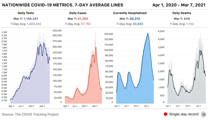
By late spring of last year, the COVID Tracking Project’s Peter Walker had developed a simple way to visualize the sweep of the pandemic—four bar charts, presented in a row, showing tests, cases, hospitalized patients, and deaths. This chart has since aired on dozens of local news stations, and has been used by state and federal officials to view COVID-19’s path over time.
The charts seem authoritative, comprehensive. Yet the work of producing these data has taught us that every metric represents a different moment in time. You aren’t really looking at the present when you look at these charts—you’re looking at four different snapshots of the past.
The COVID Tracking Project’s research, led by Kara Schechtman and Michal Mart, has found that the data travel “at different speeds.” Take case and test data—the two factors that go into the “test-positivity rates,” which officials have used to trigger lockdowns, reopenings, and other pandemic policy measures. Case numbers can move quickly; negative test results flow more slowly. Combine them, and the dates of tests and cases may not match up. Individual states can make adjustments for this kind of problem, but comparisons across states remain difficult. Worse, while negative test results lag, test-positivity rates will look higher than they actually are, keeping schools and businesses from reopening.
Source link
 Black America Breaking News for the African American Community
