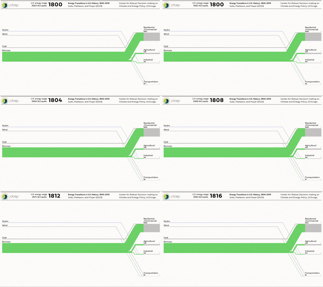
That tidbit is one of many things I learned from an astonishing new research project from Suits and his colleagues. It’s a history of the American energy system in chart form, from 1800 to 2019. It was published today:
This type of chart is called a Sankey diagram, which shows the relative size of flows in and out of a system. This particular Sankey diagram shows the inputs and outputs for the U.S. energy system, measured in watts per capita. The left side of the chart shows where energy is coming from (coal, natural gas, or petroleum) and the right side shows what it’s being used for (transportation, agriculture, or home lighting and heating).
You can find a full interactive version of their chart online. Honestly, I’ve featured this chart here in the hopes that you’ll go to their website and play around with it. There is … a lot going on in it. As far as I’m aware, this is the first attempt to put so much information about U.S. energy history in one place. “You could write a book from that Sankey alone,” Apratim Sahay, an energy consultant based in Boston, told me.
So click around! Look at what’s happening in the year you were born versus what’s happening now. Look at what the energy system was like 100 years before you were born. It will help you think more keenly about climate change.
The U.S. Energy System in 2019
In a broader sense, I’m featuring this project because it has a lot to teach us about how the energy system got to be the way it is today—and how it might change, and be made to change, in the future.
First, you can glean the big eras in American energy use from this chart. The half century from 1800 to 1850 saw the country devour biomass, most of it in the form of firewood and animal feed. In the 1870s, biomass gave way to the first fossil fuels: coal and, to a lesser extent, petroleum. (Petroleum initially dominated as fuel for lamps, not transportation.)
By the 1910s, coal was dominant. “Coal was basically doing everything in the economy except electricity,” Suits said. It heated homes, powered railroads, and helped forge steel. But it was dirty and frustrating to move, and its price was volatile. In the 1920s, it began to fade from the economy, replaced by natural gas, electricity, and—in the transportation sector—petroleum (in the form of gasoline).
This was the age of cars and electrified Sun Belt suburbs—and it lasted 50 years, until the energy crisis of the 1970s arrived and capped energy use. Since 1973, per capita energy use hasn’t increased.
In recent years, you can see natural gas driving out coal from the electricity sector. It was getting a handle on that change, actually, that led the project’s leader to start working on it in the first place. “The changes that are happening in the electricity sector now—changes that are as large as any energy transition we’ve seen—are difficult to grasp … without animating the data,” Elisabeth Moyer, an atmospheric-chemistry professor at the University of Chicago who created the project, told me.
Source link
 Black America Breaking News for the African American Community

/media/img/posts/2020/12/Screen_Shot_2020_12_08_at_4.36.48_PM/original.png)